BikePed |
TechPad |
FreshAiR
------------------------------------------------------------------------------------------
Bike-Ped Makeover
Bike Lane Map Makeover - Larger map, called
out Legend, larger font bullet, title with no shadow, renaming of title to
match report's map title. A lighter shade of blue was used to make the contrast between the black text font and the background better and more readable.
 |
| Beth Lohman |
-Elizabeth Lohman, Town of Blacksburg Corridor Committee
Member, April 4, 2012
"This
is awesome! We had some discussion about the lights during the sound
check process. Main problem is the lights are on or off, which washed
out the slides. Your suggestions would have made a difference and could
have easily been incorporated on the fly. Did not even think to change
the slides that way. "
"Erik has
a keen eye for excellent presentations, and a good understanding of what makes
a presentation exceptional. He provided us with a lot of very detailed feedback
on our presentation, which will be immensely helpful going forward as we
continue to sharpen our pitch."
From Table to Readable - The
original slide here shows a table that could likely be read in a printed report
but that is an unreadable when presented on a slide. The details are
unnecessary. The purpose of this slide appears to be to show the cost of the
orange line and three of its components. The slide on the right shows how this
same information can be reconfigured to be much more clear to the audience. The
slide also uses a large, readable font and a lighter background to provide a
high color contrast between the black font and the light blue.
------------------------------------------------------------------------------------------
TechPad Makeover
What Could Have Been
- Simulation of slide makeover for Bob's opening slide: Fonts were
changed from grey to black and increased to 60, 36, 24 Tahoma font to
increase readability and counter the bright stage lighting that washed
out text, especially near the bottom of the screen.
 |
| Bob Summers |
Last Impression and Contact Info - Example makeover
of final slide: The logo image was increased 30% from 3.08 "(h) x 3.79
"(w) to 4.0" (h) x 4.91" (w).
The font was increased 100% from 18 point font to 36 point font.
Check out TechPad at techpad.org
------------------------------------------------------------------------------------------
Focus on FreshAiR logo - Removing the
difficult-to-read light grey text on the original slide allows the audience to
focus in on the larger, more readable FreshAiR logo, the focus of the
presentation.
The logo was
increased by 65%. The text can then
be introduced 1-element-at-a-time later in the presentation using a more
readable, black font.
 |
| Dan Burgess |
-Daniel Burgess, MoGo Mobile Co-Founder & FreshAiR presenter, April
17, 2012
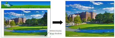
Tell the Story - The new slide
displays the large image better
and maximizes comprehension.
and maximizes comprehension.
Removed the
unnecessary drop shadow, covered the background logo and header, and used the entire
screen.
The image was
cropped and increased by 22%.
Check out FreshAiR at playfreshair.com
------------------------------------------------------------------------------------------


The BEFORE and AFTER examples are great!
ReplyDeleteSmall world: I know Beth very well.