Wednesday, February 26, 2014

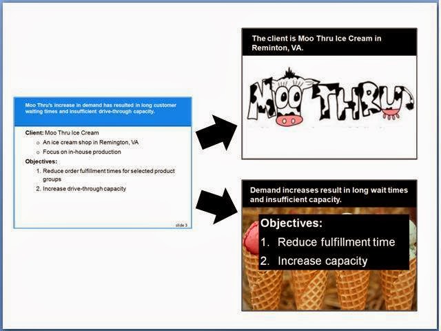
Effective Presentations and Moo Thru makeover example

Opening from 2/25/14 Senior Design (ISE 4006) discussion at Virginia Tech: If you only have 30 seconds, then read this. Effective presentations involve engaging the audience and realizing you are married. Tie your materials and points to a core message. Strategically use blank slides to pull attention to you and give the audience a visual break. Go analog when preparing slide materials (turn the computer off and use a whiteboard, journal, and then sticky notes). Build-up slides instead of blasting the audience with info are married too. As a start, use the ergonomics principles of good slide design by Durso and colleagues. Join Toastmasters. Learn how to use images effectively and video record yourself to improve. And yes, realize you are already married – to your data – and your audience is not familiar with your stuff so explain it simply.

Before (1 slide)

After (2 slides with relevant images, bigger fonts, better contrast)

Now click below to read Durso's 4-pager on Evidence-Based Presentation Guidelines:

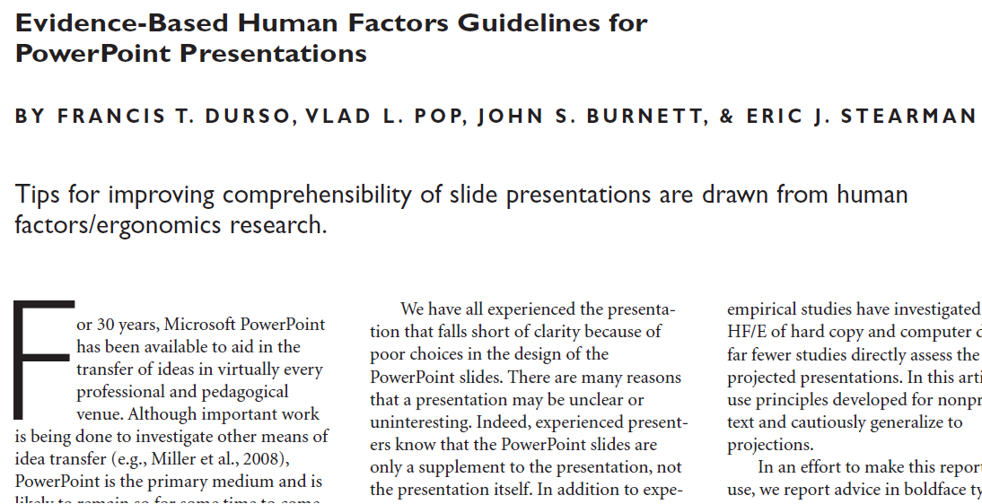
 Evidence-Based Human Factors Guidelines for PowerPoint Presentations

Monday, February 24, 2014

Perfect Pitch at NuSpark


Dropped by NuSpark tonight to see the facilities for my 3/4/14 Perfect Pitch presentation from 7-8 pm. Sherry was great and we did a quick walk-through with the projector, computer, room set-up, and slides. Looking forward to it. Check it out more at https://www.facebook.com/nusparkspace or the event link at https://www.facebook.com/events/794907003871712/?ref=23

Thursday, January 16, 2014

Planning Presentations for Senior Design

Heard from Pat Koelling on 1/16/14 at VT re. giving a 2/25/14 talk for Senior Design on slide design. Should be fun!

Friday, November 2, 2012

Presentations: Slide Guidelines & Makeovers

Wow, what a great workshop at Virginia Tech's Faculty Development Institute yesterday! Twenty of us, including students, faculty, and staff from 17 different departments came together to learn and share about designing user-friendly electronic slides. After intros, we reviewed the Durso et al (2011) evidence-based PowerPoint slide guidelines and then broke out into groups to start makeovers for 3 different sets of slides, provided ahead of time by willing participants. Part 2 (open to anyone) will be 11/8/12 at 10 am!

Saturday, September 8, 2012

HFES User-Friendly Presentations


CANCELLED Sign up now for my workshop, User-Friendly Presentations: Pitches, Guidelines, Makeovers & Tools, on Monday, 10/22/12 as part of the Human Factors and Ergonomics Society's 56th Annual Meeting. CANCELLED
  • Want to design a presentation that is both easy to deliver and easy for your audience to follow and understand?
  • Did you know oral communication skills was ranked #1 and presentation skills was listed as another important work-related skill in a HFES member educational needs survey?
Join Dr. Erik CB Olsen starting at 1:30 pm for HFES Workshop #7 - a new, interactive presentations workshop.
·         After individual “personal pitches” participants will then learn a method of organizing their ideas into a presentation – before turning on the computer.
·         Then we’ll review Durso’s 5 PowerPoint slide guidelines on font, color, layout, charts, and comprehension.
·         We will then collectively learn to conduct slide makeovers.

The workshop will benefit a mixed audience including students and people new to human factors as well as experienced presenters who want to fine-tune their presentation skills.
  •  No experience making presentations is required but knowing the basics of PowerPoint or Keynote is useful.
  • Participants are encouraged to submit electronic slides prior to the workshop.
See the full HFES description online, visit the registration page or go to https://www.hfes.org/.

CANCELLED Register today to reserve your spot! CANCELLED


Friday, June 29, 2012

23 second slide video: Introduce 1-element-at-a-time

Erik showing the 1-element-at-a-time concept
I just made a 23-second video (from my longer videos) for my User-Friendly Presentations playlist - this video explains and demonstrates the power of splitting up a slide into elements and building the slide up by showing and explaining each element one at a time. You can still use the full slide as an overview, but then introduce each portion of that slide one part at a time to make it more understandable to your audience, who is not familiar with your data, slides, or presentation.

Friday, June 15, 2012

3 quick slide makeovers in a minute

Want to see a slide makeover in action? How about 3 of them in about a minute? Check out the video below I made recently.